Million Dollar Homepage Alternative?

Posted on

Is the 10 Million Dollar Page created by Al Paul an alternative or clone to the Million Dollar Homepage created by Alex Tew 12 years ago?

The answer is neither yes nor no.

Yes. The pages and layout are similar. Both have a pixels-for-sale philosophy. Both are 1000x1000 grids of pixels broken into blocks of 100 pixels each. Both offer(ed) advertisers an image and a link. Both are successful in that both sites have participating merchants displaying their ads.

But that is where the similarities end. In addition to the image and link, the 10 Million Dollar Page offers a popup. This popup provides the consumer a sampling of what the merchant has to offer. The image and the link are not fixed on the 10 Million Dollar Page. The 10 Million Dollar Page is designed so that it can change every hour.

The Million Dollar Homepage is stale, with over 1/5 of its links stagnant. The 10 Million Dollar page is fresh with active, current merchants. Its links will never stale out, by design.

The Million Dollar Homepage filled in every available block and did not require a minimum purchase. This resulted in a somewhat cluttered look. The 10 Million Dollar Page is providing the merchants with decent size footprints on its Grid. There is also spacing between all the merchants, provide a more open look and feel.

The Million Dollar Homepage made its owner $1,000,000 dollars upfront from their advertisers. Alex trumped the market with that feat! The 10 Million Dollar Page gets its owner revenue through affiliate marketing (percentage of successful sales).

The 10 Million Dollar Page was written with the advertiser and the consumer in mind. It was tailor written for the most popular ad types. It is scalable with an expansion strategy.

In conclusion, although both websites are very similar to one another, they are not a clone of each other. Each one is unique enough to make its own distinct mark with the internet community.


Feel free to leave your opinion by contacting us
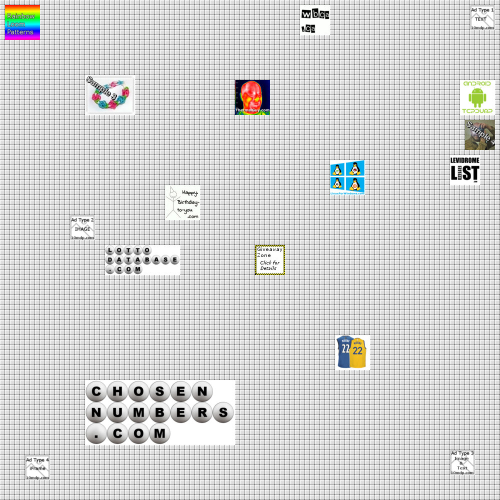


A Permanent Mark

Posted on

We know, what type of title is this. On July 17th, we posted The Woes of Getting the Word Out. In it we mentioned how search engines are ignoring our front page image because it is a "Background" image. And it is true. When we search the internet with all major search engines, we do not see a single image of our GRID. So, without further ado, we are leaving a permanent mark by posting an image of our GRID, so search engines are happy (and more so, we are happy :).

10 Million Dollar Page

Note: Since this blog is "home grown", the image below will always be a current snapshot of what the current GRID image is, so don't let the date of the blog throw you off.

And to leave an additional mark, here is a reference or download link to our GRID image. 10-million-dollar-page.jpg


Leaving a Tip?

Posted on

We will be attempting to get the word out a number of ways. We will be leaving pitches with various online news agencies.. Here is the general wording for our pitch:

Million Dollar Page Revived?
The Million Dollar Homepage was hugely popular 12 Years ago. The original creator said it was a one time phenomenon. Many have tried since and failed. Now, the 10 Million Dollar Page is starting to take off with advertisers coming on board daily. Will it overtake the original in popularity? Time will tell. Check out the 10 Million Dollar Page at https://10milliondollarpage.wbca.ca.

Note: I am the creator of the 10milliondollarpage.com. If you have any questions, feel free to email me at my personal email (xxx@xxx)

We will see if this sparks any interest.


The Woes of Getting the Word Out.

Posted on

Firstly, thanks to all the partners who have joined our site. It is really exciting seeing the page filling up. But now to explained the title. Our goal was always to go with organic search engine results. An "If you build it, they will come" philosophy. However from a SEO point of view, our site means nothing. Our main page has grown tremendously since June! Our main page is THE page, the 10 Million Dollar Page. But from a SEO perspective, it has not changed a bit. There is no "content". The main grid image on our home page is actually a background. The links and advertisements are all javascript based. As such, most search engine bots do not see much changing on the page because many ignore or at least do not put much importance into backgrounds, and many do not run javascript. Search engines love content.

So even though the content is changing, almost daily, none of the search engines are recognizing these changes. So, in order to get the word out, we have to now look at other techniques. One was the campaign which launched last week (Social Media via Facebook). We have some additional ideas in mind, so once again, stay tuned.


Another Campaign

Posted on

We have now a good number of partners on our site. Now to start with one of our campaigns. One of our partner sites, Rainbow Loom Patterns is featured on our site. Their facebook account has 2000+ friends. Rainbow Loom Patterns posted publically and to their friend list on Facebook that they are on our site. They also linked backed to our site. This should spark some interest in the 10 million dollar page.


More Affiliates Added

Posted on

We have been adding affiliates to our site gradually over the past month. We are currently sitting at 12 affiliates. Our goal is to have about 30 affiliates before we start another campaign. The goal of our previous campaign we had near the beginning of the year was to get clients onto our site. This time the campaign will be to get visitors to our site. We have plans for this. As normal, we will release details in our blog after the campaign has launched. But first, more affiliates.