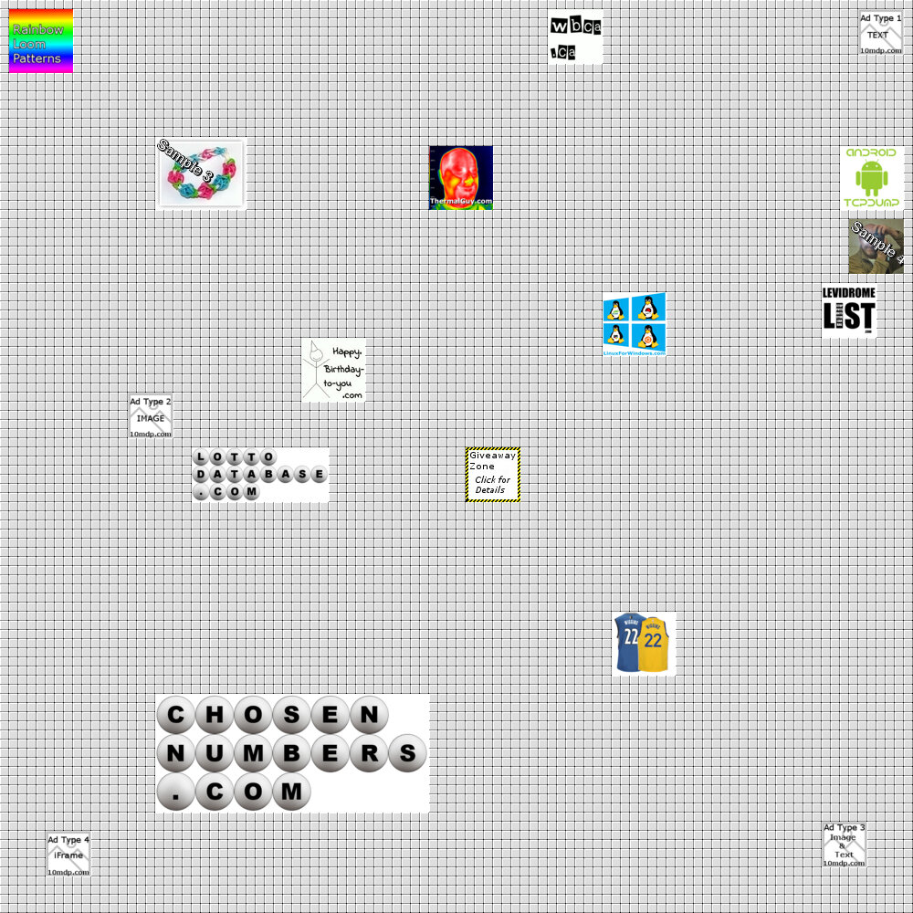
We made a cosmetic change to our GRID image. That is the main page image with all the advertisements. When we first started the site, we had initially had the GRID setup as a GIF image. The reasoning for this was it allowed us the ability to create an animated gif if required. We had plans to have either flashing squares, or holiday themes, all possible with animated gifs. However, we had been noticing that some of the more colorful logos of our partners were not looking as sharp as they could. So, in order to have a cleaner and sharper look of our main page, we changed the background GRID image to a JPEG image. We will keep the other image around still (and update it as frequently as we do the main GRID image), but will be referencing the JPEG image.
You can do a side by side comparison, and you can see the differences:
The GIF image (10-million-dollar-page.gif):
The JPEG image (10-million-dollar-page.jpg):

